07/10/2016

Forecast for today: Major brainstorm in the living room


Please excuse the atrocious handwriting and numeral spelling mistakes.
This is what it looks like when I write as fast as I think.

Like my literature teacher once said, it looks like a drunken spider ran across the page.


Making marks and shapes

Fast warm-up 2 min drawings


This session was mainly about observing the negative and positive spaces more carefully.
I can tell if I was just tired or maybe my glasses should have been cleaned better but I found it hard to focus on the different spaces this time.


Quick 2 min gesture drawing.
Really really wishes we had more of an opportunity to do more gesture drawings.
Especially if we had to capture a story or moment of the pose quickly.
Maybe bring in some props? 

5 min drawing


NOTE: I shouldn't wait around really. It is university and we should be learning a lot more independently. I might message some acting students or dance students on the campus. 
Who knows right? They might let me pop in for a rehearsal.

A pastor, middle age village, comedy series and George Hammond Steel

I've mentioned this briefly in a previous post but one of our latest projects, which I'm really enjoying, is called PICK'N MIX.
We were all given four cards at random.
One card for main character, one for setting, one for style and the last for genre.

Our job is to put all the elements together to make a possible animation.
Luckily my cards somehow fit together really well although I still find it rather hard trying to make a comedy series using George Hammond's style.
Wasn't sure if the beautiful layered style would distract from the humour of the series??

But then I did think of MirrorMask (2005) which did have an beautiful and elaborate design yet still managed to contain and even emphasis the characters witty humour.

Image result for Mirror mask

Anywho and anyhow, here is some of my developmental work so far.

As my show is set in the middle ages, I did some research on the architecture back then. I also looked at painting and drawings depicting old medieval villages.
This one is by Giovanni Antonio Canal.

A background experimental drawing of mine, trying to combine medieval architecture and Hammond's style.

Early character designs


29/09/2016

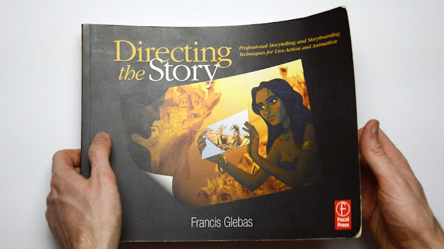
Directing the Story by Francis Glebas

If anyone is struggling with storyboarding or is interesting in what makes a great storyboard 
check this book out!


Honestly on of the easiest reads I've ever come across in a educational book.
It is basically a story that tells you how to tell a great story.

I feel like I've learnt so much already from it and a lot of things that were mentioned before in last years lecture makes a lot more sense now. I even understand now where I went wrong with my previous storyboards and why it looked odd at the time.

Another reason why I love this book is because it reminds you repeatedly of  your audience.
Asking you to think about what they would be doing, feeling or how they would understand the characters.

Anyways, enough of my raving.
Go check it out!


Studying George Hammond Steel


We were given a style, character, setting and a genre of show to create a story from to pitch.
While designing the story, we are meant to research each one we were given.
For my style I got St. Ives School and from doing my research on the different artists that came out of St.Ives school I found George Hammond Steel.

(One of his paintings based on the Cornish seaside)

(My digital study of his style and layering)


Drawing with your gut, not your brain


                               I found myself becoming a lot more gentle with my lines this session.
It was very hard and at the end I was quite worn out but I felt like I learnt a lot of knew things.                            


I learnt about how it is natural, through observation of art and other people's work around us, to end up reflecting those styles in our life drawing. Especially as students.
I was told that I had been subtly drawing in a rather graphic-type of style.
Looking back at my old work I can definitely see what he means.
Men just seemed to look like generic men and the female models kind of looked like generic women.

I was told that to be a good observer you must almost let go of any influences from outside and focus on what in front of you.
Draw the model for who she or he is. 


Also draw honestly.
Don't draw what you don't see. If there is not difference in the tone then there is none.


Matt Nava

I found his blog!!
http://www.mattnava.com/

I've been following his work since Journey's concept art was released and using a lot of his drawings to learn about compositions.